December 1, 2023

High Risk Merchant Account
The Psychology of Payment Page Design — Increasing Conversions!
In the ever-evolving landscape of e-commerce, where every click and interaction counts, the design of a payment page plays a pivotal role in determining whether a potential customer completes a transaction or abandons their shopping cart. Beyond the aesthetics and functionality, the psychology behind payment page design can significantly influence user behavior and conversion rates. In this exploration, we delve into the intricacies of payment page psychology and uncover strategies to elevate your design for optimal conversions.
Understanding User Behavior:
Before delving into payment page specifics, it’s crucial to comprehend the psychology of user behavior during the online purchasing process. Users often exhibit a heightened sense of caution and scrutiny as they approach the payment stage. Building trust and alleviating anxiety become paramount at this critical juncture.
Trust Signals:
Secure Icons and Certifications: Displaying recognizable security badges and SSL certifications instills confidence in users, assuring them that their sensitive information is protected.
Clear Privacy Policies: Transparent communication about data privacy and security measures fosters trust and addresses concerns that may arise during the transaction.
Minimizing Cognitive Load:
Simplified Information: Overwhelming users with excessive information or form fields can lead to cognitive overload. Streamlining the payment process by requesting only essential details reduces friction and enhances user experience.
Visual Hierarchy:
Prominent Call-to-Action: The placement and design of the “Submit” or “Pay Now” buttons should command attention. Using contrasting colors and strategic positioning guides users toward completing the transaction.
Optimizing Design Elements:
Now that we’ve established the foundational principles of user psychology, let’s explore specific design elements that can be optimized to enhance the effectiveness of payment pages.
Color Psychology:
Trust and Security: Blue and green tones are associated with trust and security. Incorporating these colors into the payment page design can subconsciously evoke feelings of reliability.
Urgency and Action: Red and orange colors can create a sense of urgency, encouraging users to proceed with the payment promptly. However, moderation is key to avoid inducing anxiety.
Typography Choices:
Clarity and Readability: Choose fonts that are easily readable, especially for critical information like payment amounts and confirmation messages. Clear typography enhances user comprehension and instills a sense of professionalism.
Imagery and Visual Elements:
Reassuring Imagery: Including images that convey security, such as padlocks or shields, reinforces the idea of a safe transaction environment.
Progress Indicators: A visual representation of the payment process, like progress bars, keeps users informed about the steps involved, reducing uncertainty and impatience.
Personalization:
User-Friendly Interfaces: Incorporate personalization by prefilling known information, such as shipping addresses, and offering suggestions based on user history. This not only saves time but also creates a tailored and user-centric experience.
Behavioral Economics in Payment Pages:
Understanding the principles of behavioral economics can further enhance payment page design. By tapping into cognitive biases and decision-making patterns, businesses can subtly guide users towards completing transactions.
Anchoring Effect:
Strategic Pricing Display: Displaying the original price alongside a discounted rate creates an anchoring effect. Users perceive the discounted price as a better deal, potentially increasing the likelihood of conversion.
Loss Aversion:
Emphasizing Security: Highlighting the potential loss or risks associated with not completing the transaction can trigger a sense of loss aversion. This can be achieved through subtle messaging about the secure nature of the payment process.
Choice Architecture:
Limited Choices: Offering too many payment options can overwhelm users. Presenting a curated selection of popular and secure payment methods simplifies decision-making, aligning with the principles of choice architecture.
Mobile Responsiveness and Accessibility:
As the prevalence of mobile commerce continues to rise, ensuring the responsiveness of payment pages across various devices is paramount. The principles of mobile-first design and accessibility contribute significantly to user satisfaction and conversion rates.
Mobile-Optimized Forms:
Thumb-Friendly Design: Optimize form fields and buttons for easy navigation using thumbs. This minimizes the risk of input errors and frustration, particularly on smaller screens.
Loading Speed:
Instant Gratification: Mobile users, in particular, value speed. Implementing techniques to optimize page loading speed ensures a seamless experience, reducing the likelihood of users abandoning the payment process due to delays.
Accessible Design:
Inclusive User Interface: Incorporating accessibility features, such as screen reader compatibility and adjustable font sizes, ensures that a diverse range of users can navigate the payment page effortlessly.
Testing and Iteration:
The dynamic nature of user preferences and technology mandates a commitment to continuous testing and iteration. Implementing A/B testing allows businesses to gather valuable insights into user behavior and preferences, enabling data-driven refinements to payment page design.
A/B Testing Parameters:
Button Placement: Experiment with the placement of the “Submit” button to identify the optimal location that maximizes user interactions.
Color Variations: Test different color schemes to understand which combinations resonate best with your target audience.
Form Length: Explore variations in the number of form fields to determine the ideal balance between collecting necessary information and minimizing friction.
User Feedback Integration:
Surveys and Feedback Loops: Actively seek feedback from users regarding their payment experience. Analyzing user comments and suggestions provides qualitative insights that complement quantitative data from A/B testing.
Conclusion — Transforming Insights into Conversions:
Mastering the psychology of payment page design involves a nuanced understanding of user behavior, strategic implementation of design elements, and continuous refinement through testing. By incorporating trust signals, optimizing visual elements, leveraging behavioral economics, and prioritizing mobile responsiveness, businesses can create a payment experience that not only meets user expectations but surpasses them.
In a digital era where competition is fierce, the ability to convert potential customers into satisfied buyers hinges on the mastery of payment page psychology. Embracing the principles outlined in this exploration positions businesses to not only increase conversion rates but also cultivate lasting relationships with their online audience. As the e-commerce landscape continues to evolve, the art of payment page design remains a dynamic and essential facet of online success.

More related blogs

- Merchant services company
- QSA audit preparation
What Is PCI DSS 4.0 Level 1 Certification and Why Is It Important? 
- Merchant services company
- QSA audit preparation
- Sole Proprietorship Formation
- what is ultimate beneficial ownership in KYB compliance
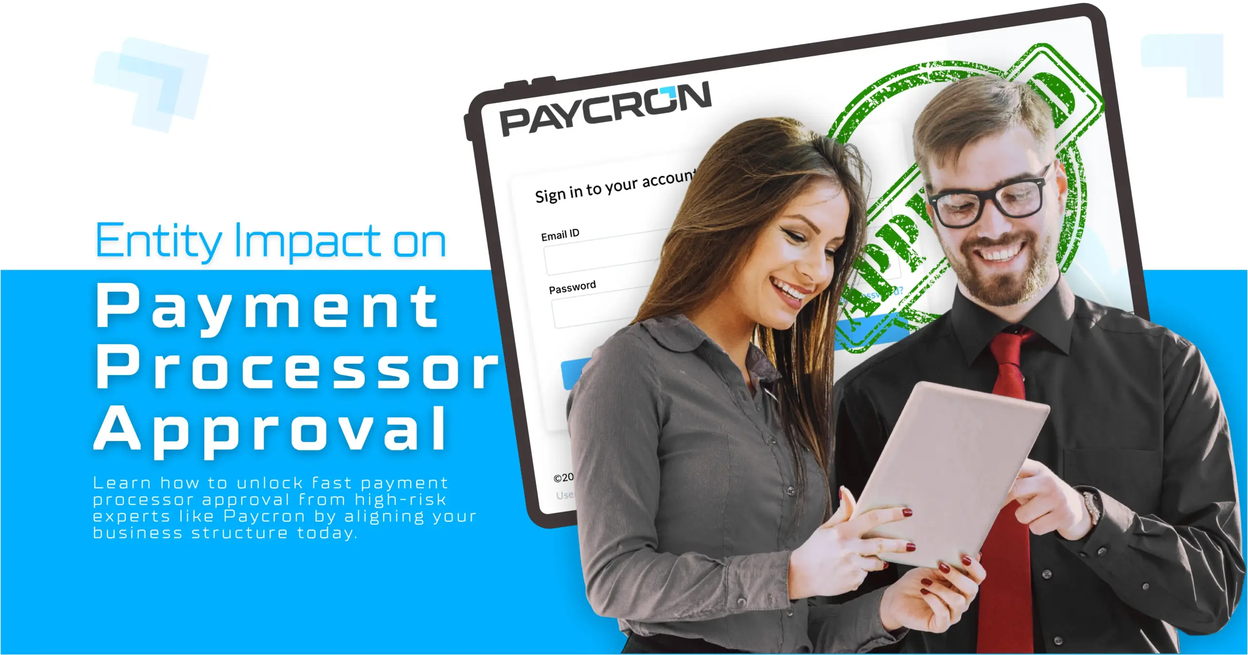
How Your Business Structure Shapes Payment Processor Approval in 2026?
- Sole Proprietorship Formation
- what is ultimate beneficial ownership in KYB compliance
- ACH Payment Processing
- mobile payment processing options
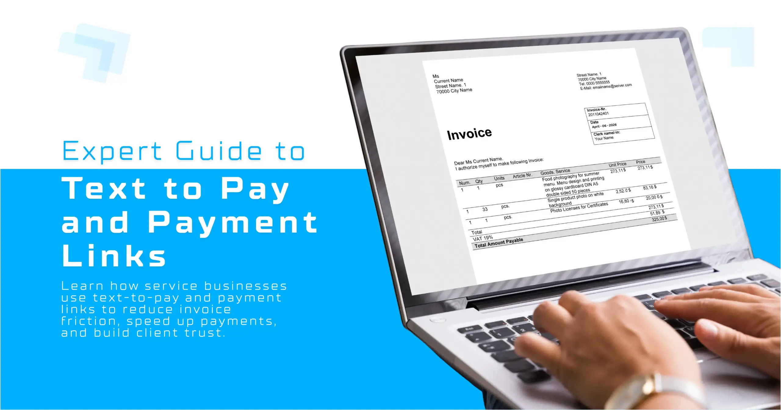
The Ultimate Expert Guide to Text to Pay and Payment Links for Service Businesses.
- ACH Payment Processing
- mobile payment processing options


